Inside Corvus Template
The next generation layout and structure compliments the beautiful and intricate design of the template in conjunction with its many features and integrated plugins
Interested? Want to try Corvus?
DownloadResponsive Layout
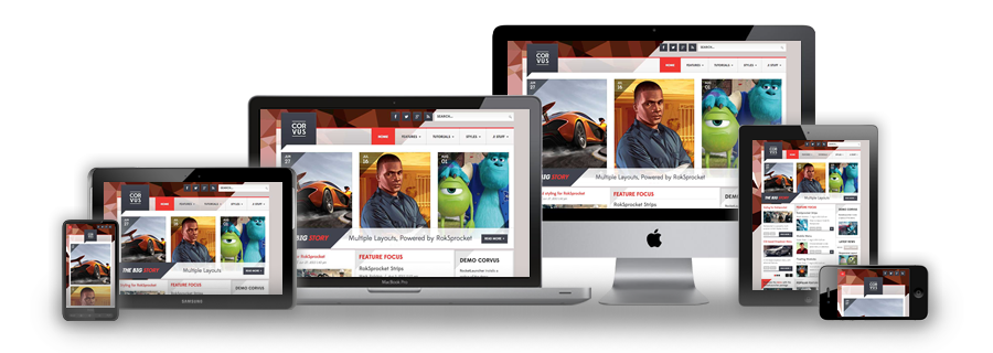
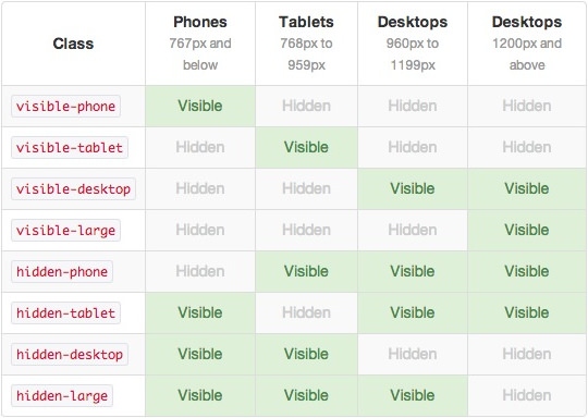
A responsive design automatically adapts itself to a particular viewing environment such as desktop, tablet or mobile, without the need for separate layouts for varying platforms


Inside Corvus Template
The next generation layout and structure compliments the beautiful and intricate design of the template in conjunction with its many features and integrated plugins
Interested? Want to try Corvus?
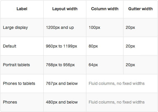
DownloadIn terms of media queries, the breakdown is:
/* Smartphones */
@media (max-width: 480px) { ... }

/* Smartphones to Tablets */
@media (min-width: 481px) and (max-width: 767px) { ... }

/* Tablets */
@media (min-width: 768px) and (max-width: 959px) { ... }

/* Desktop */
@media (min-width: 960px) and (max-width: 1199px) { ... }

/* Large Display */
@media (min-width: 1200px) { ... }

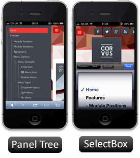
For mobile devices, there are two options, a dropdown panel menu with items in a tree format or a select box using the browsers own UI elements. Choose a format in the Gantry Menu.
The Dropdown Menu is a CSS driven dropdown menu, offering such features as multiple columns, inline icons, subtext, custom column widths, item distribution and menu offsets.
SplitMenu displays 1st level items in the navigation bar and children in the Sidebar.