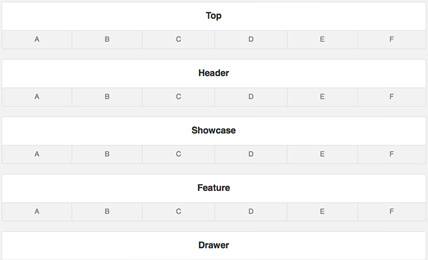
The next generation layout and structure compliments the beautiful and intricate design of the template in conjunction with its many features and integrated plugins
Responsive Layout
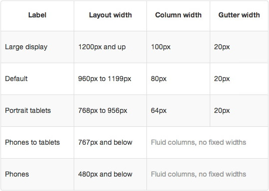
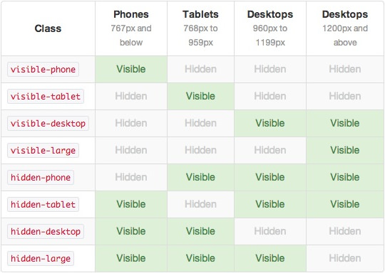
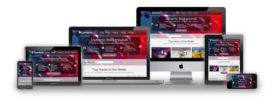
A responsive design automatically adapts itself to a particular viewing environment such as desktop, tablet or mobile, without the need for separate layouts for varying platforms
A responsive design automatically adapts itself to a particular viewing environment such as desktop, tablet or mobile, without the need for separate layouts for varying platforms
Responsive Frameworks
We use the responsive layout based on Twitter's Bootstrap Framework, with its collection of utility classes, to provide a flexible responsive design.
Read BlogRocketTheme Plugins
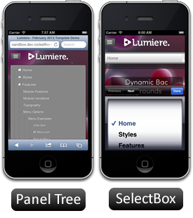
The RokSprocket and RokGallery plugins are built to work with a responsive layout and support mobile touch events, such as 'swipe'.
Read BlogMedia Queries in JavaScript
We have created a new helper class, RokMediaQueries.js, which provides a unified system that enables extensions to add media query listeners.
Read Blog
