Everything You Need to Build Your Stunning Website
Powerful Framework that Makes Building Websites Easier

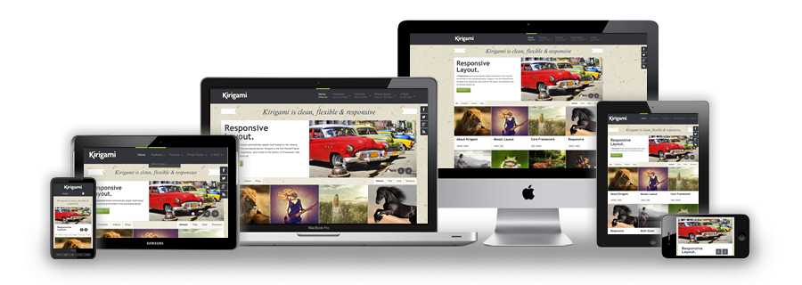
We use the responsive layout based on Twitter's Bootstrap Framework, with its collection of utility classes, to provide a great degree of flexibility for a responsive design.
Read BlogKirigami comes with the RokSprocket and RokGallery extensions that are built to work with a responsive layout and support mobile touch events, such as 'swipe'.
Read BlogWe have created a new helper class, RokMediaQueries.js, which provides a unified system that enables extensions to add media query listeners.
Read Blog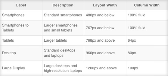
Kirigami's responsive grid system is designed for desktop, tablet and smartphone systems, each with minor modifications to ensure compatibility in each mode. The table above shows the breakdown of screen resolutions and associated devices, and what layout characters are then applied to each.
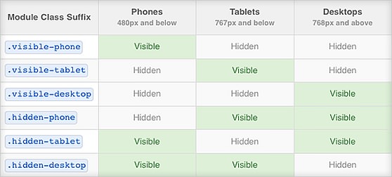
Another useful feature available, via Bootstrap, is the collection of responsible utility classes that can be used to help tweak layouts by providing a simple method of showing or hiding modules. Insert the above module class suffixes into your module settings to show/hide a module for a particular mode.
In terms of media queries, the breakdown is:
/* Smartphones */
@media (max-width: 480px) { ... }

/* Smartphones to Tablets */
@media (min-width: 481px) and (max-width: 767px) { ... }

/* Tablets */
@media (min-width: 768px) and (max-width: 959px) { ... }

/* Desktop */
@media (min-width: 960px) and (max-width: 1199px) { ... }

/* Large Display */
@media (min-width: 1200px) { ... }
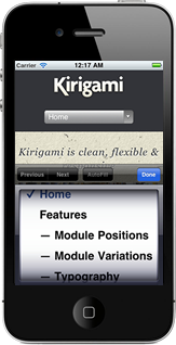
The menu system for a smartphone device will be that of a select-field. A select field is a great solution for this because most phones have nice native select UI elements. Using this method is necessary as to make the menu accessible on the mobile devices, as Fusion, and our other menu types, are simply too complex to render effectively on these devices. A new menu system will be created that is responsive, but will form part of Gantry
