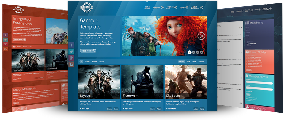
Responsive Layout
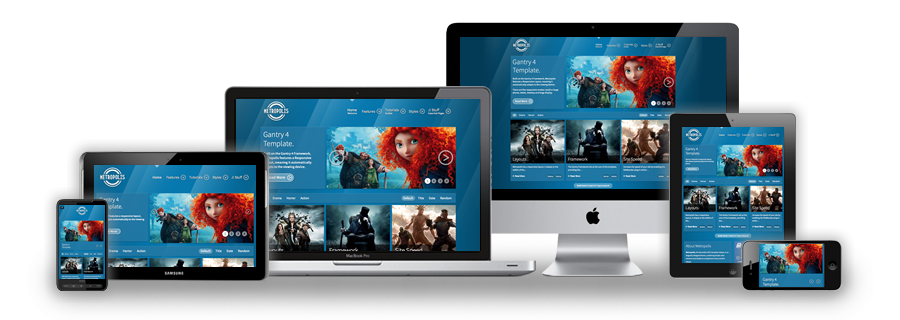
A responsive design automatically adapts itself to a particular viewing environment such as desktop, tablet or mobile, without the need for separate layouts for varying platforms
image

Responsive Frameworks

We use the responsive layout based on Twitter's Bootstrap Framework, with its collection of utility classes, to provide a flexible responsive design.

Read Blog

RocketTheme Extensions

The RokSprocket and RokGallery extensions are built to work with a responsive layout and support mobile touch events, such as 'swipe'.

Read Blog

Media Queries in JavaScript

We have created a new helper class, RokMediaQueries.js, which provides a unified system that enables extensions to add media query listeners.

Read Blog

Responsive Layouts

image

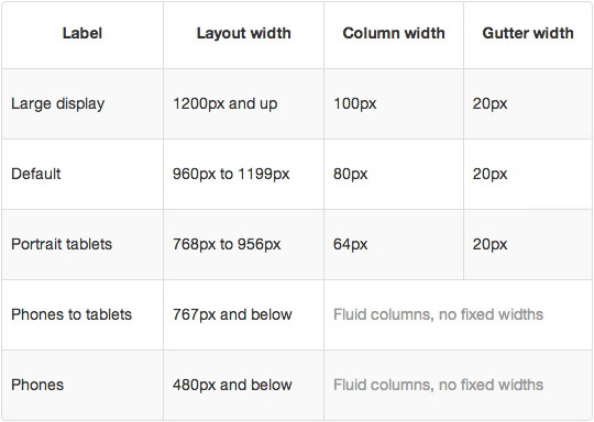
Metropolis's responsive grid system is designed for desktop, tablet and smartphone systems, each with minor modifications to ensure compatibility in each mode. The table above shows the breakdown of screen resolutions and associated devices, and what layout characters are then applied to each.

Responsive Classes

image

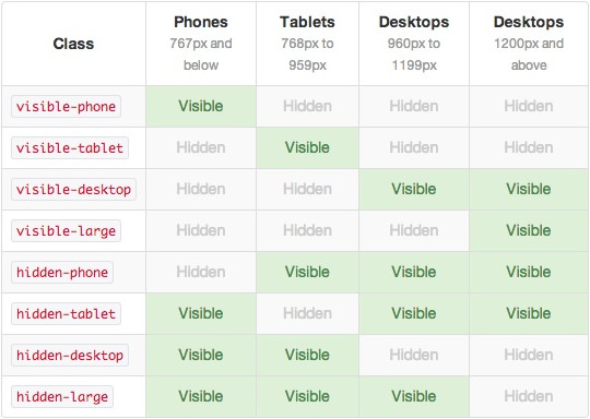
Another useful feature available, via Bootstrap, is the collection of responsive utility classes that can be used to help tweak layouts by providing a simple method of showing or hiding modules. Insert the above module class suffixes into your settings to show/hide a module for a particular mode.

Media Queries

In terms of media queries, the breakdown is:

/* Smartphones */
@media (max-width: 480px) { ... }

/* Smartphones to Tablets */
@media (min-width: 481px) and (max-width: 767px) { ... }

/* Tablets */
@media (min-width: 768px) and (max-width: 959px) { ... }

/* Desktop */
@media (min-width: 960px) and (max-width: 1199px) { ... }

/* Large Display */
@media (min-width: 1200px) { ... }

Navigation

image

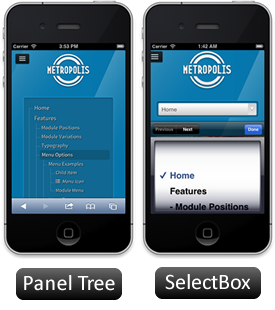
For mobile devices, there are two options, a dropdown panel menu with items in a tree format or a select box using the browsers own UI elements. Chose a format in the template's menu settings.

The Dropdown Menu is a CSS driven dropdown menu, offering such features as multiple columns, inline icons, subtext, modules and positions, custom column widths, item distribution and menu offsets.

SplitMenu displays 1st level items in the navigation bar and children in the Sidebar.


The next generation layout and structure compliments the beautiful and intricate design of the template in conjunction with its many features and integrated extensions

image

Inside Metropolis Template
Everything You Need to Build Your Stunning Website


Gantry 4 Framework
Powerful Framework that Makes Building Websites Easier
  • Compact Grid System
    CSS grid framework to construct content by providing commonly used dimensions
  • Stunning Admin UI
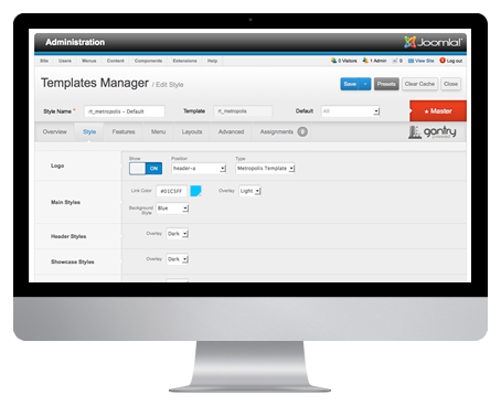
    Gantry provides a uniquely intuitive interface to control all aspects of the design
  • Integrated Features
    Many built-in features such as font-sizer, Google Analytics, Date, etc
image
  • Source-Ordered Layout
    With up to 3 total sidebars, you can achieve highly complex mainbody layout scenarios
  • Grid RTL Support
    Built in RTL support which will automatically order the layout to support RTL
  • Multi-Page Configuration
    Assign different template configurations for one or several menu items/pages

Interested? Want to try Metropolis?
Download